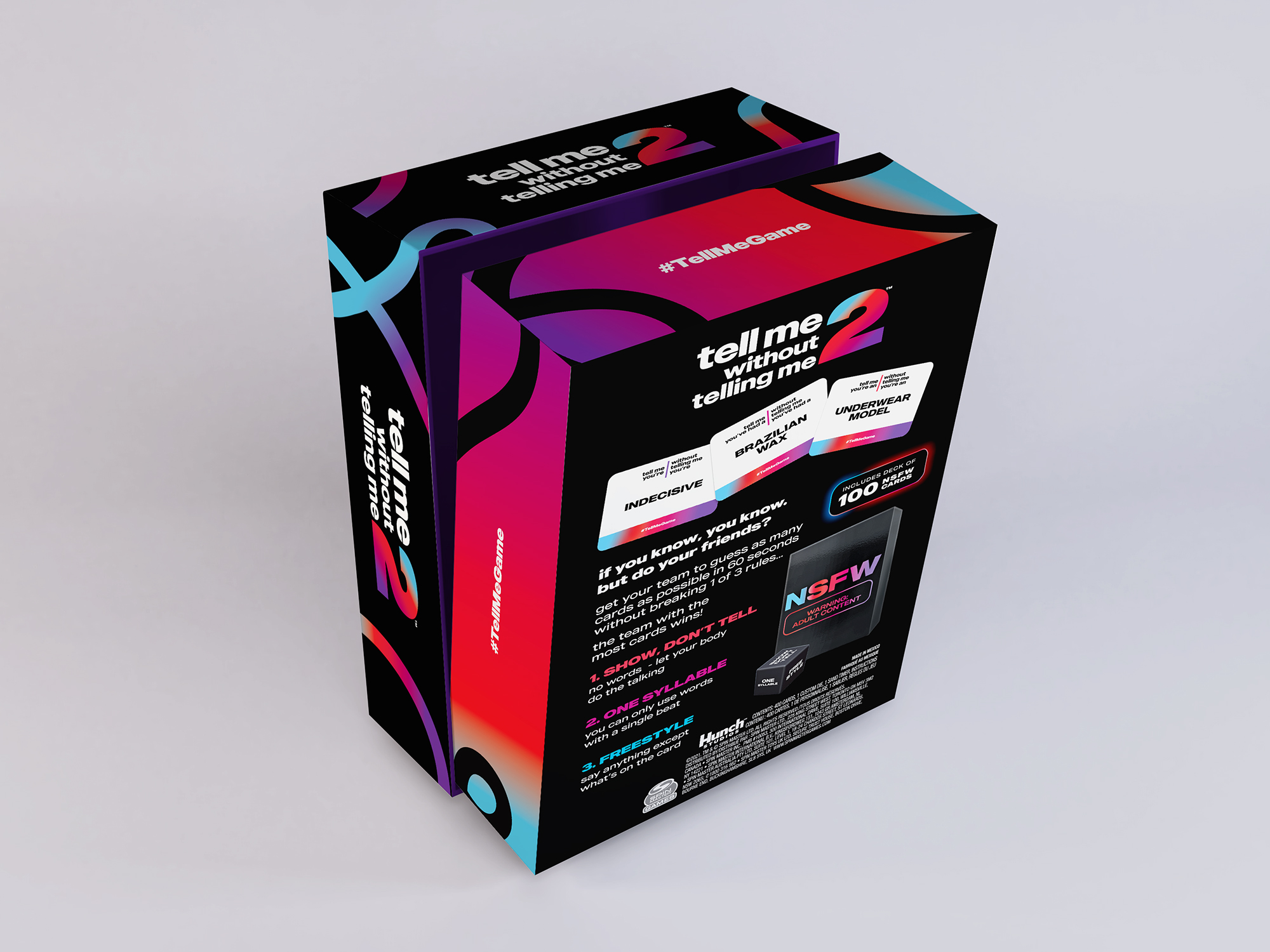
Tell Me Without Telling Me 2
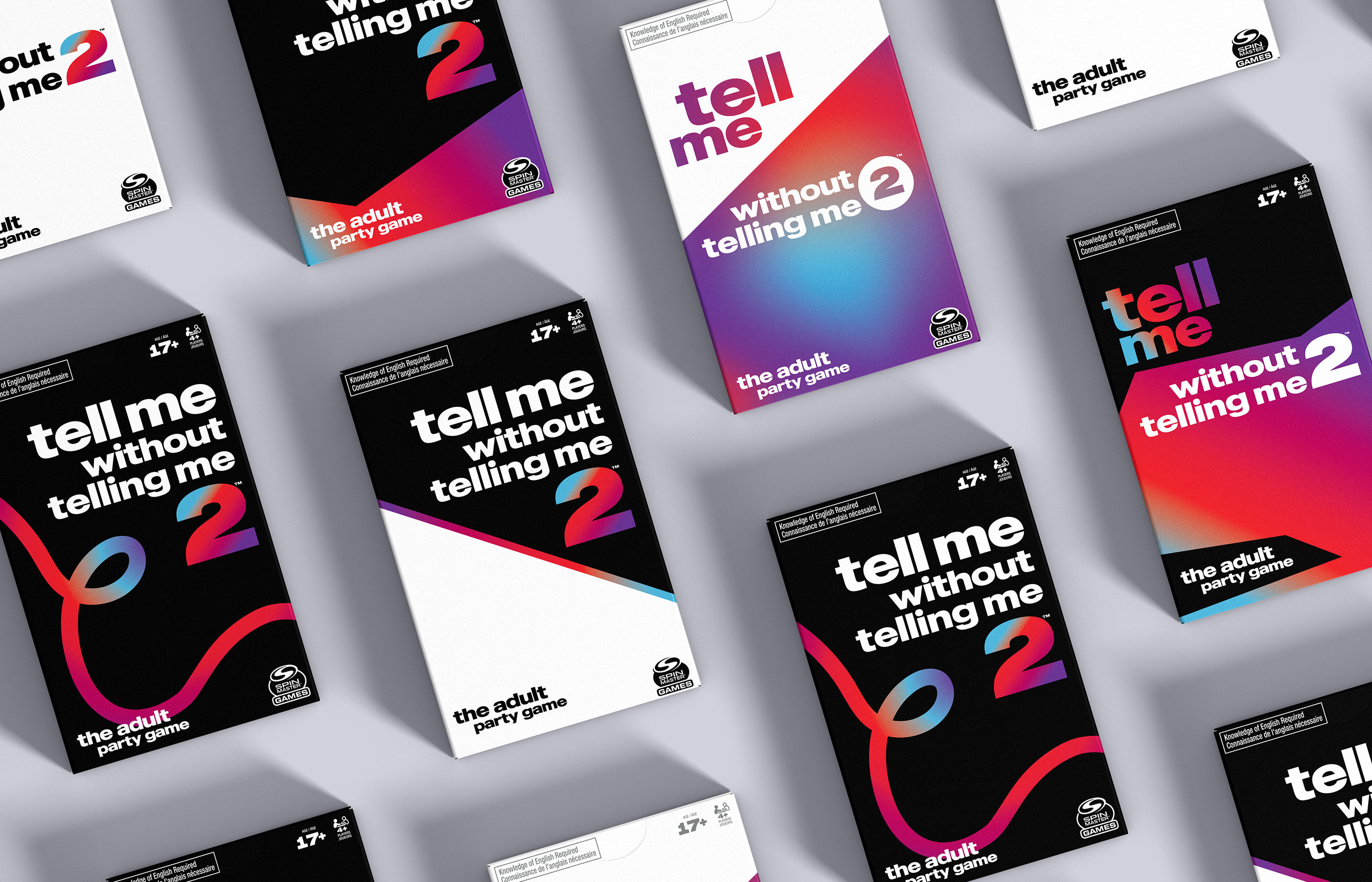
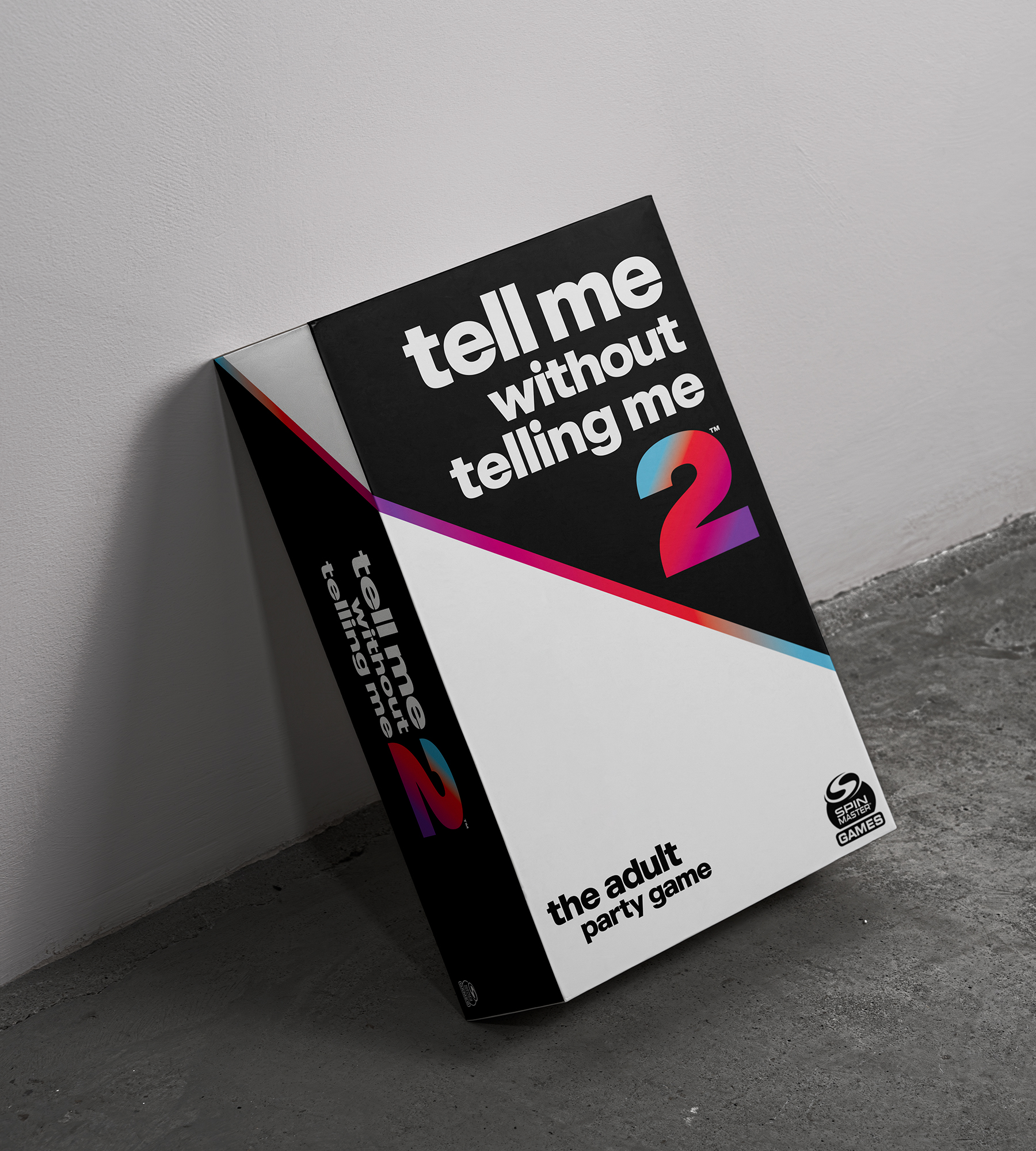
Spin Master approached Powerstation with a request to develop several design concepts for the upgraded version of their popular board game, Tell Me Without Telling Me. While the team was open to exploring fresh design ideas, they wanted to maintain the same color palette and typography used in the original game to ensure brand consistency.
I had the opportunity to create a variety of design concepts that captured the essence of the game while also exploring new creative directions. Although the final choice was a simpler, inverted version of the original design for Tell Me Without Telling Me 2, the concepts I created were well received by the Spin Master team. The process was both challenging and rewarding, allowing me to push creative boundaries within established guidelines, and I thoroughly enjoyed working on this project.
Brand Challenge:
When I first began working on the new packaging designs for Tell Me Without Telling Me 2, Spin Master wasn’t entirely sure of the direction they wanted to take. The initial brief was quite broad, with the main directive being to retain the same colors and logo from the original game. This left me with a certain level of creative freedom but also the challenge of ensuring that the new designs remained connected to the first game while exploring new possibilities.
The lack of a clear vision upfront allowed me to experiment with various design concepts, trying out different approaches to capture the fun, engaging spirit of the game, while still keeping it familiar for returning fans. Ultimately, this freedom gave me the opportunity to push boundaries, but also required careful balancing to ensure the new designs would still resonate with the original concept.